
Data Quality Dashboards
At-a-Glance Data Quality Insights — Native or Custom BI Tools.
Get at-a-glance Data Quality insights from Lightup's native dashboards, or bring your own BI tool to build custom Data Quality dashboards for executive reporting and decision-making.
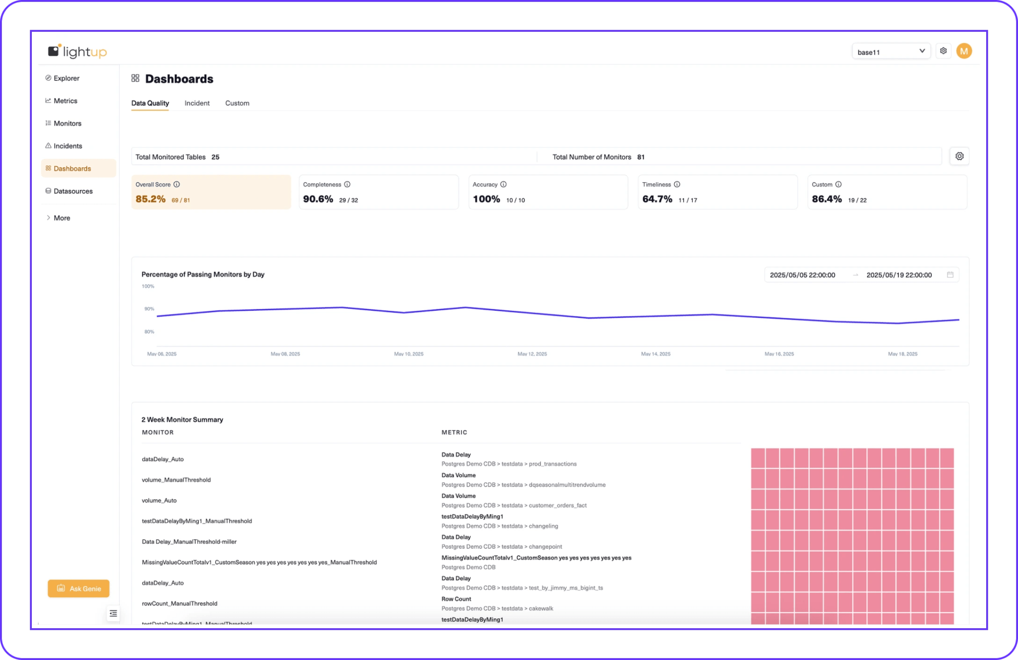
Lightup Data Quality Dashboards
You’re proactively monitoring metrics in Lightup. You’ve prevented weekend overtime by catching incidents before downstream impact. And now you need to report on Data Quality to show the status and results.
Lightup provides built-in dashboards for at-a-glance Data Quality health insights, such as:
- Total number of monitors and monitored tables
- Accuracy, completeness, timeliness
- Overall health score
- Custom metrics
Custom Data Quality Dashboards
For organizations that prefer their own BI and analytics tools, Lightup supports custom Data Quality dashboards using popular enterprise applications, including:
- Power BI
- Tableau
- Apache Superset
- Any BI or analytics tool that connects to Postgres
How It Works
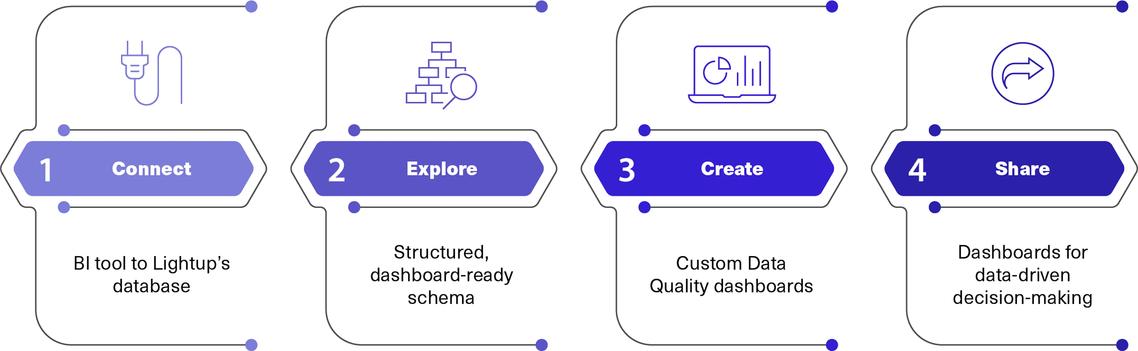
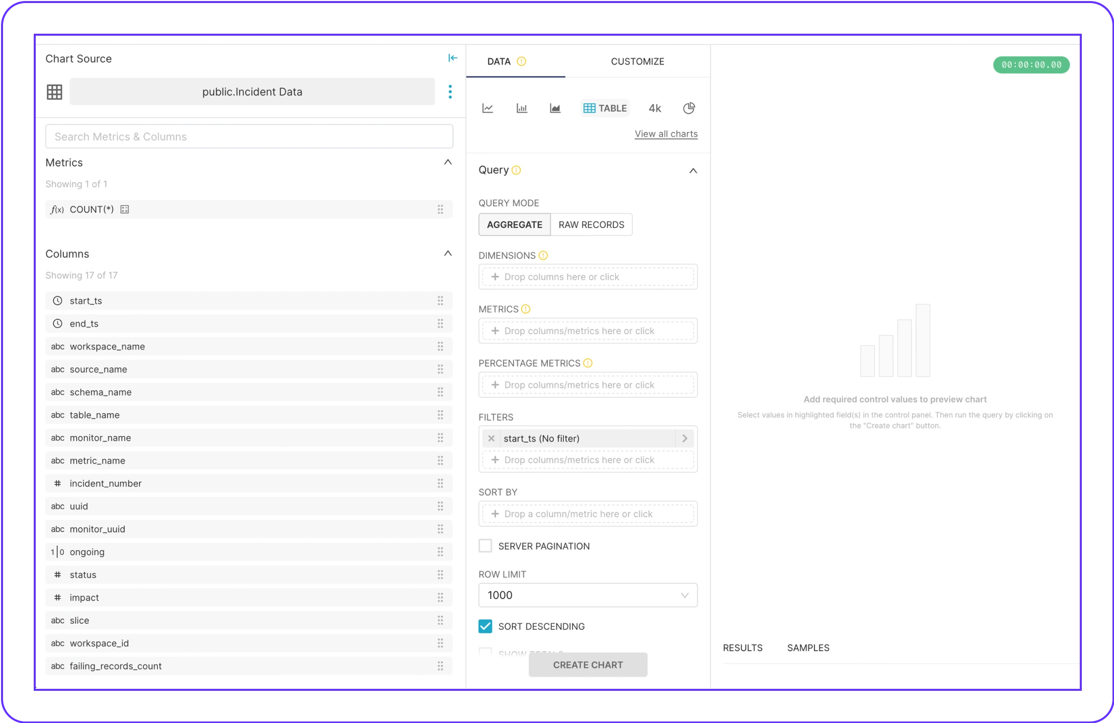
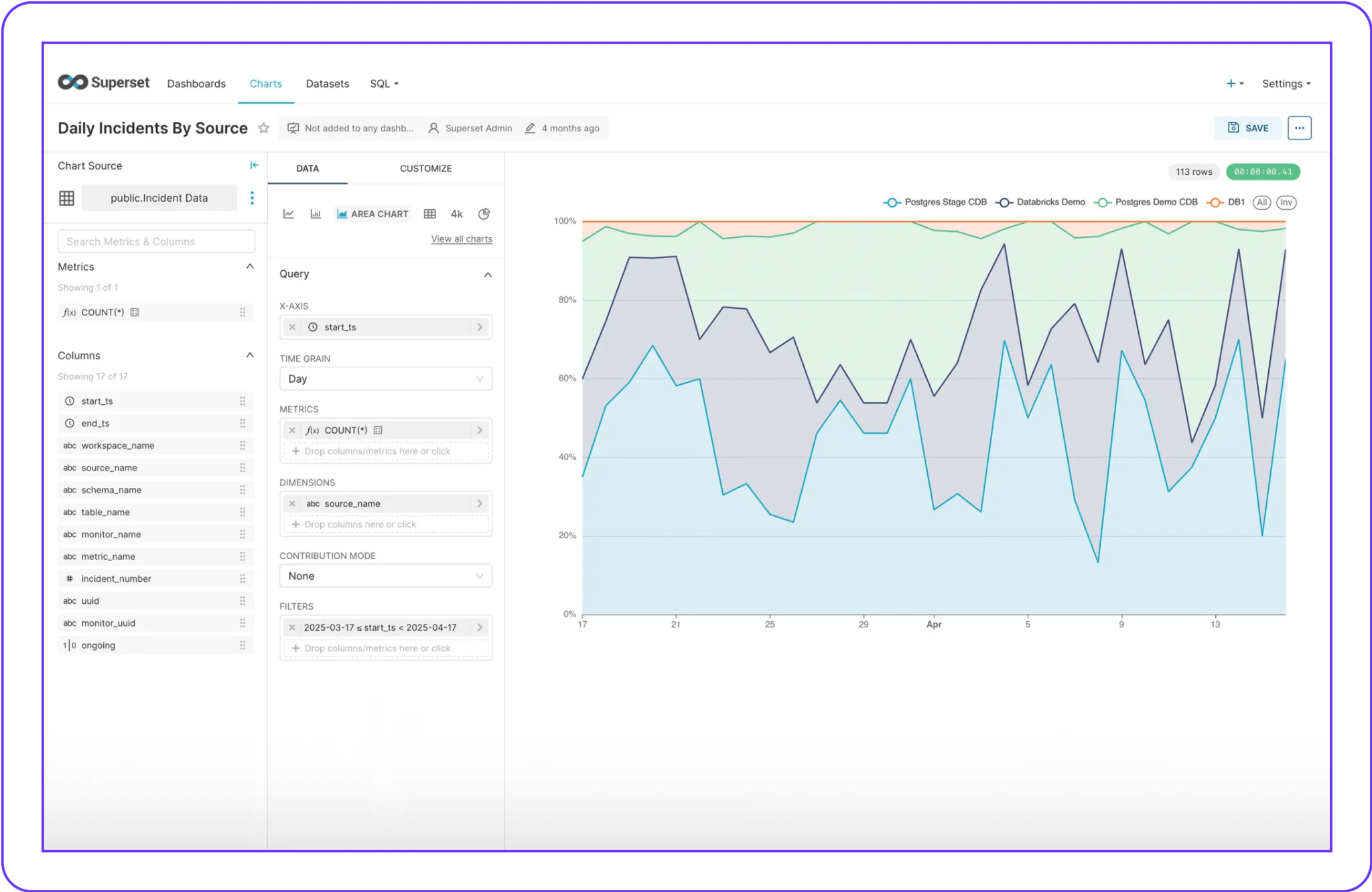
Dashboard-Ready Schema
Lightup enables access to a structured schema designed for business intelligence (BI) and analytics, allowing your team to create dashboards and reports with Lightup metrics, such as:
- Daily data incidents by source
- Active vs. failed monitors
- Count of failing records
- Metric and monitor names
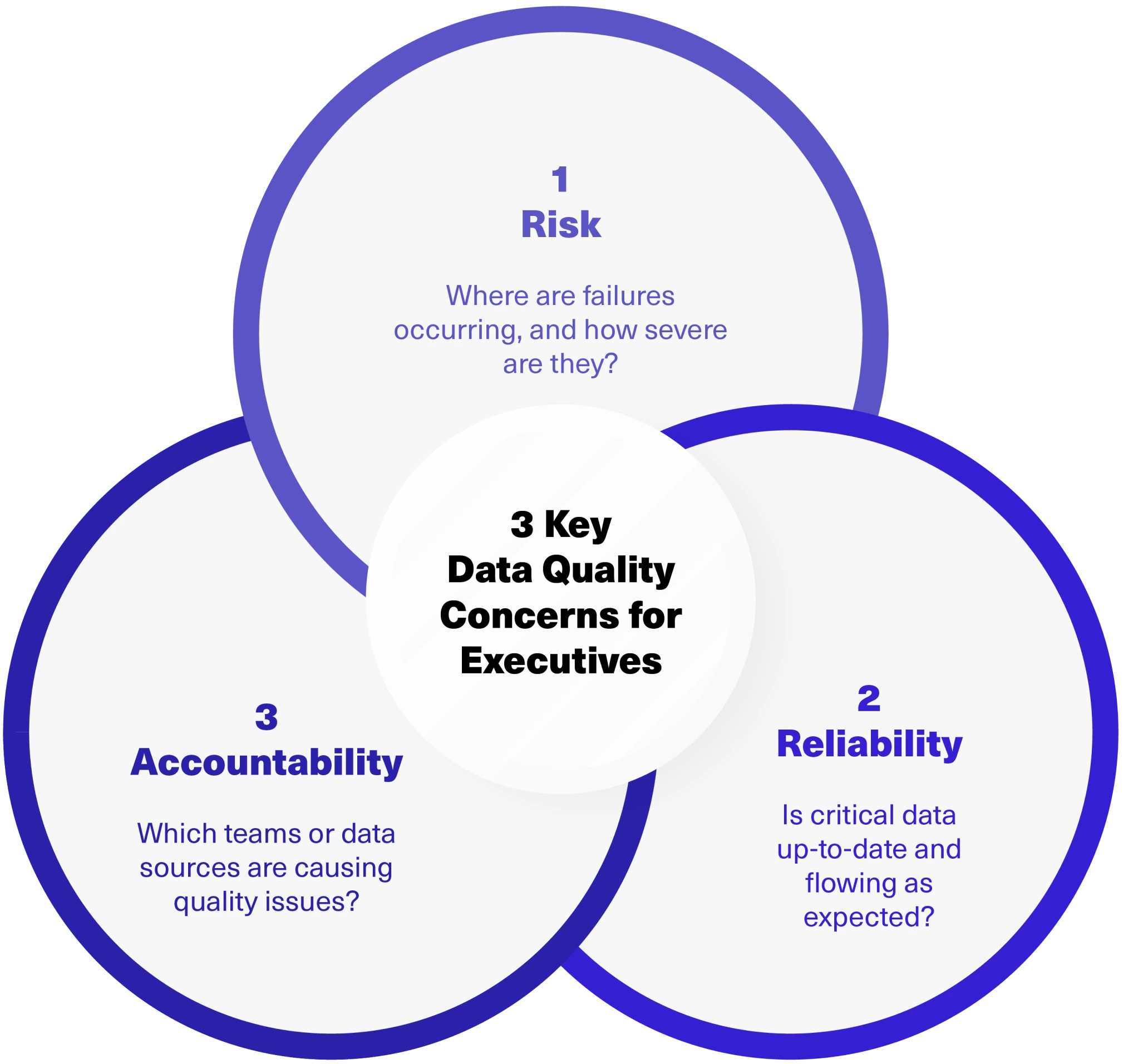
Executive Data Quality Dashboards
Executives don’t need dashboards showing every Data Quality metric — they need an aggregated view of data health that tells them if the business can trust the data.
Key data health metrics for executive dashboards include:
- Data freshness and timeliness for high-value pipelines
- Overall Data Quality score
- Severity status of incidents
- Trends by product, department, or data source
- Daily/weekly incident volume by source
- Percentage of rules passing vs. failing over time
- Top problematic data sources
- Percentage of critical assets monitored
Deliver Data Quality Insights to Every Stakeholder.